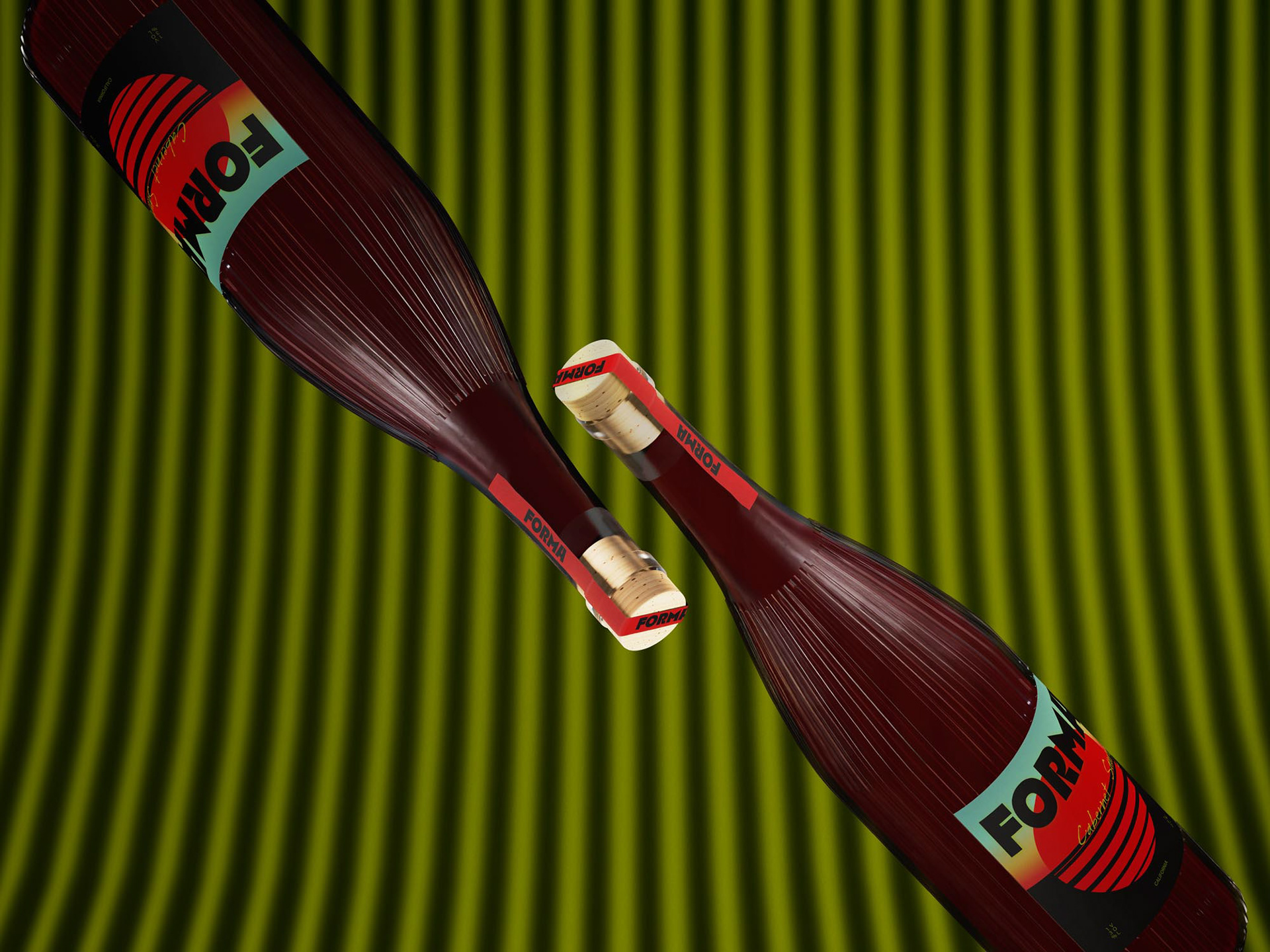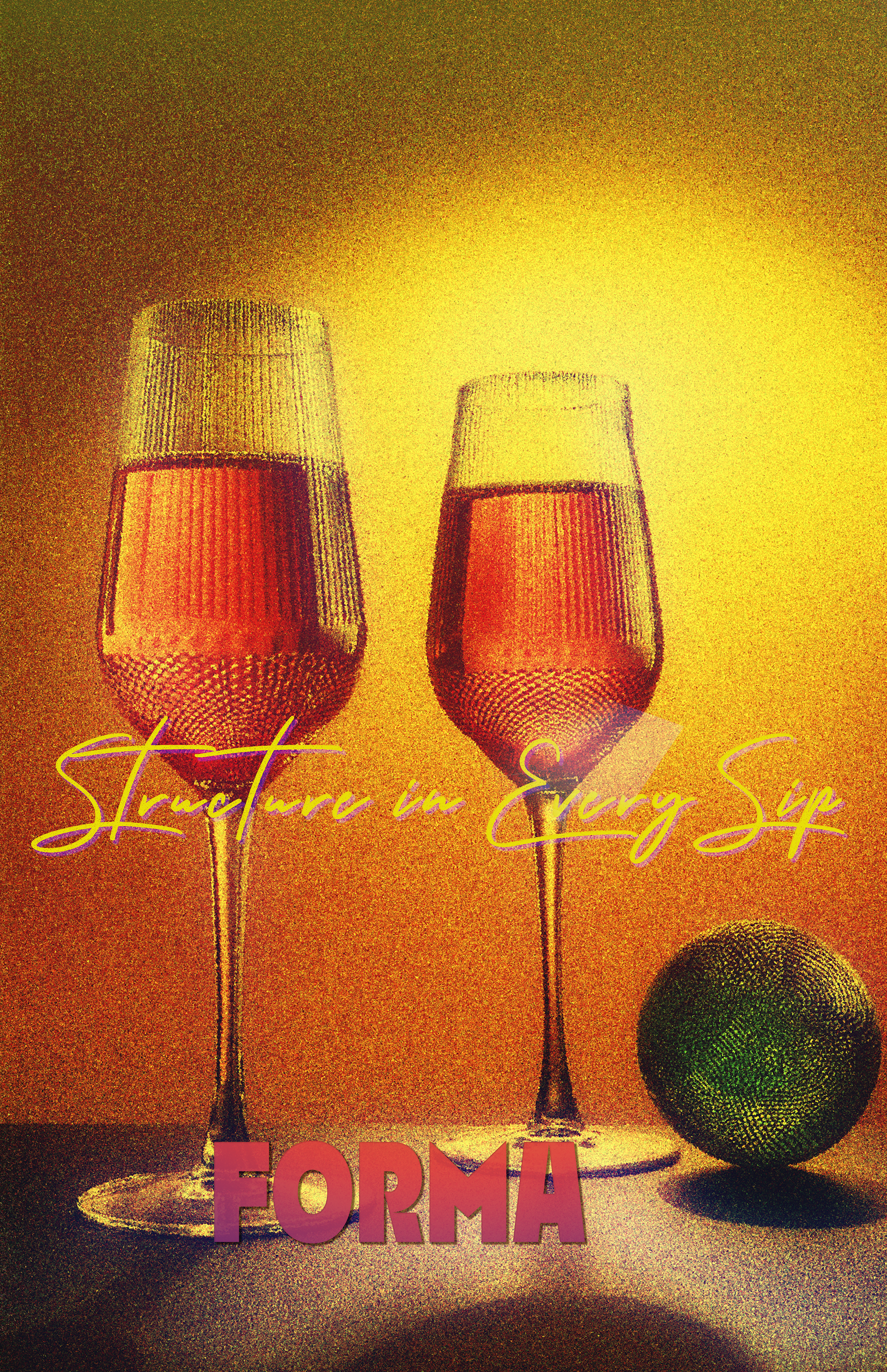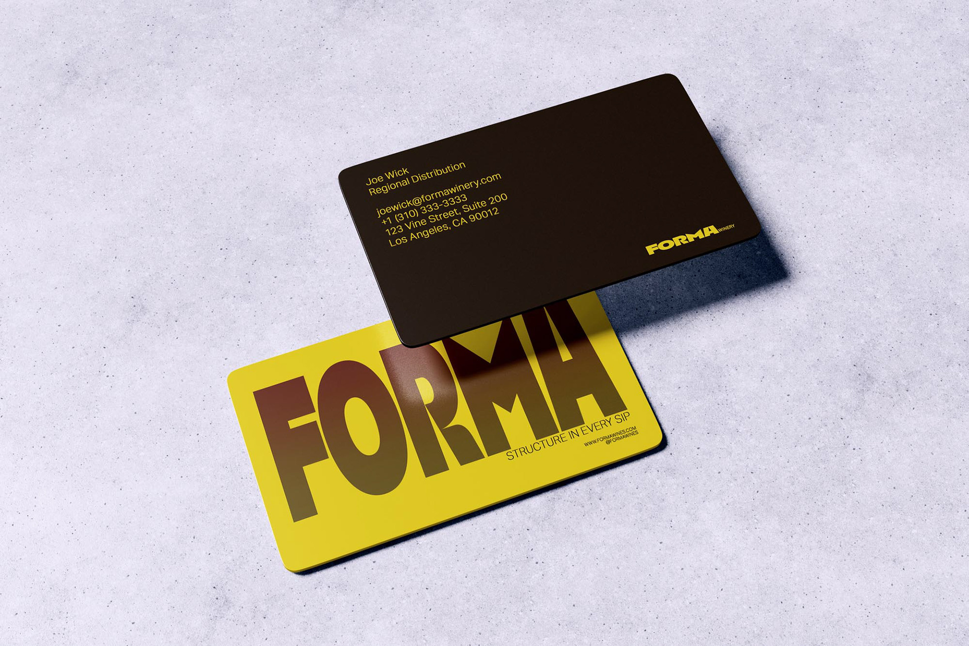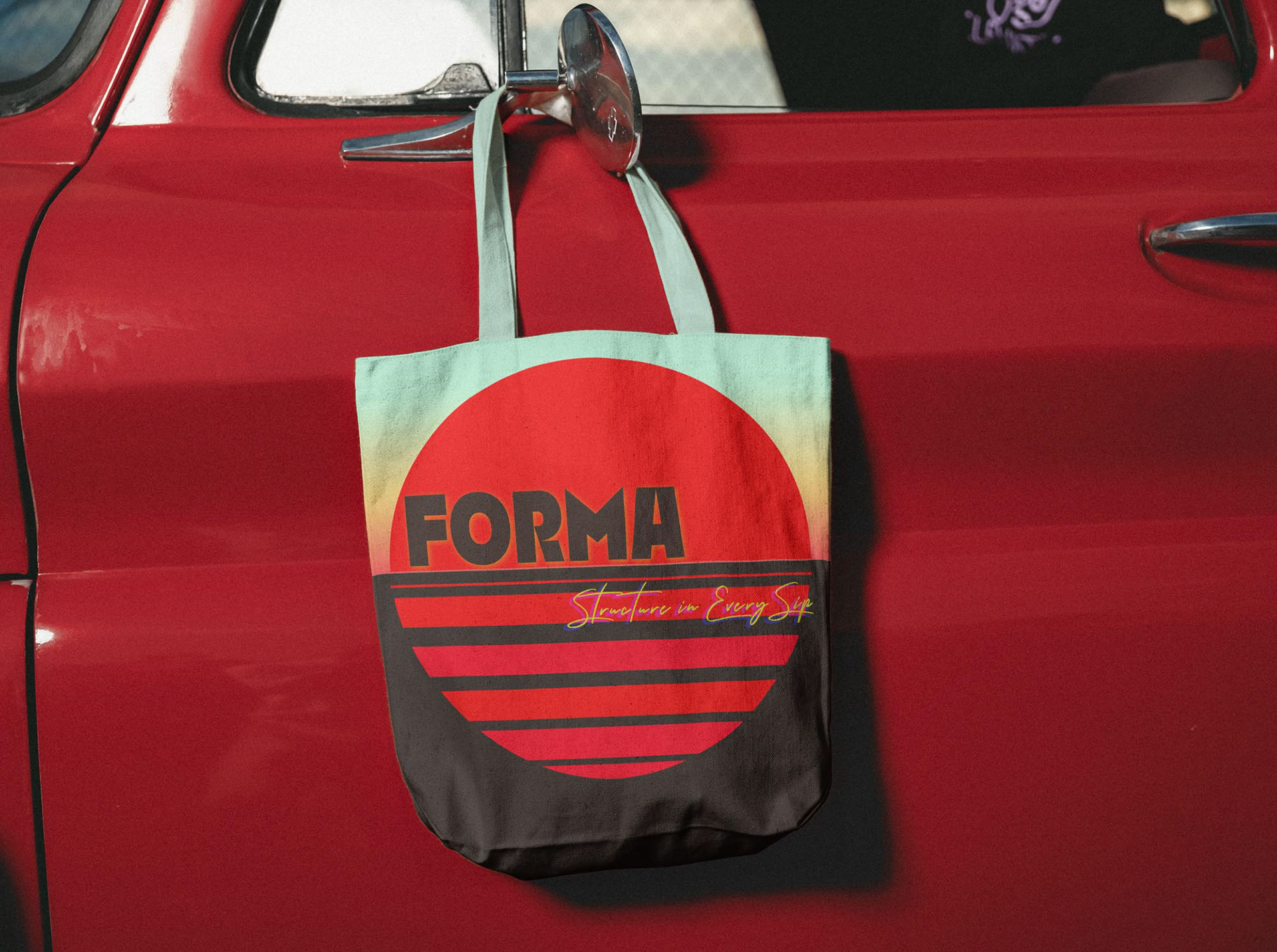
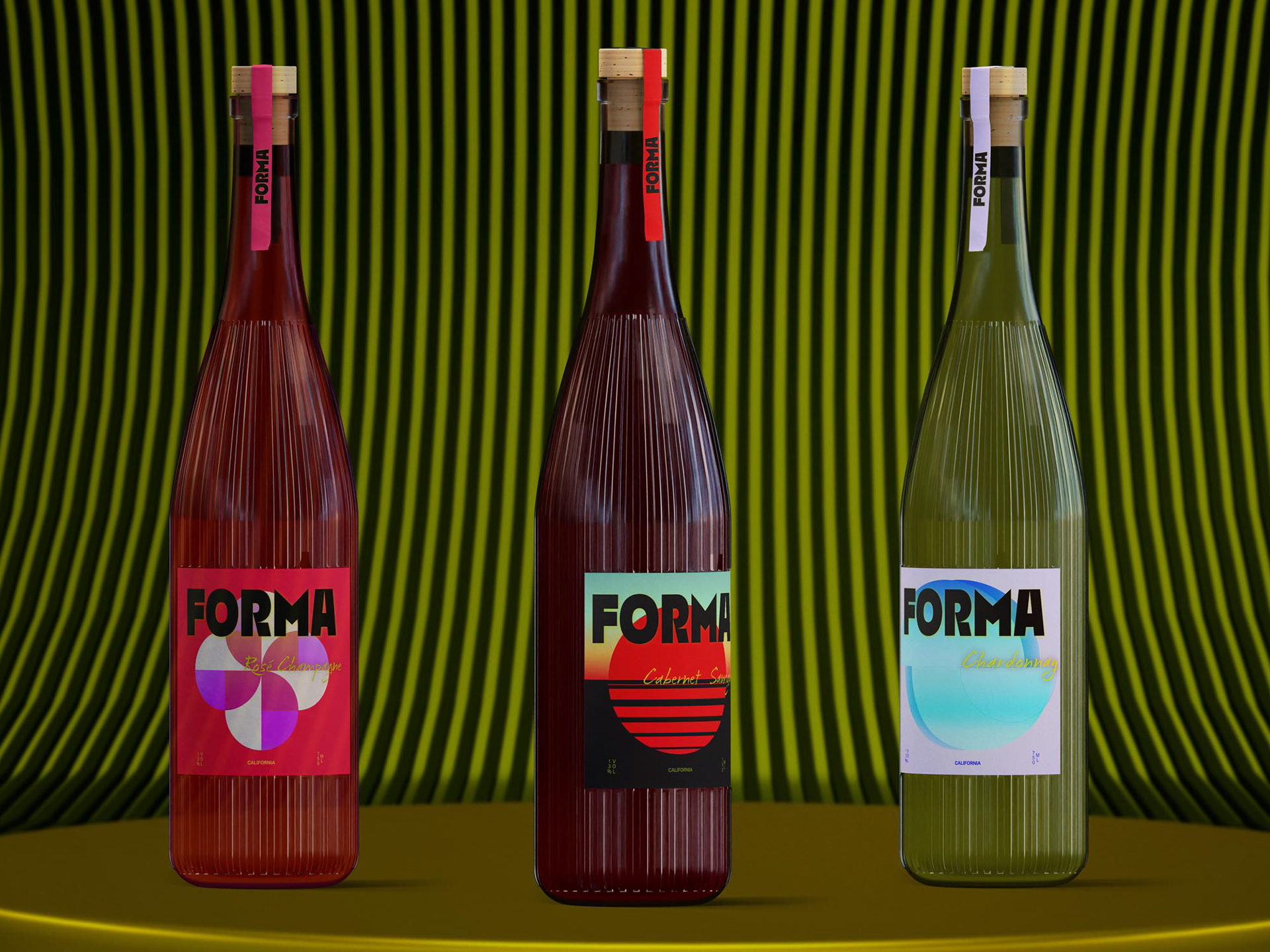
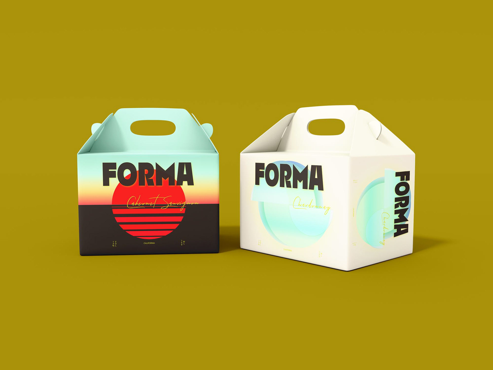
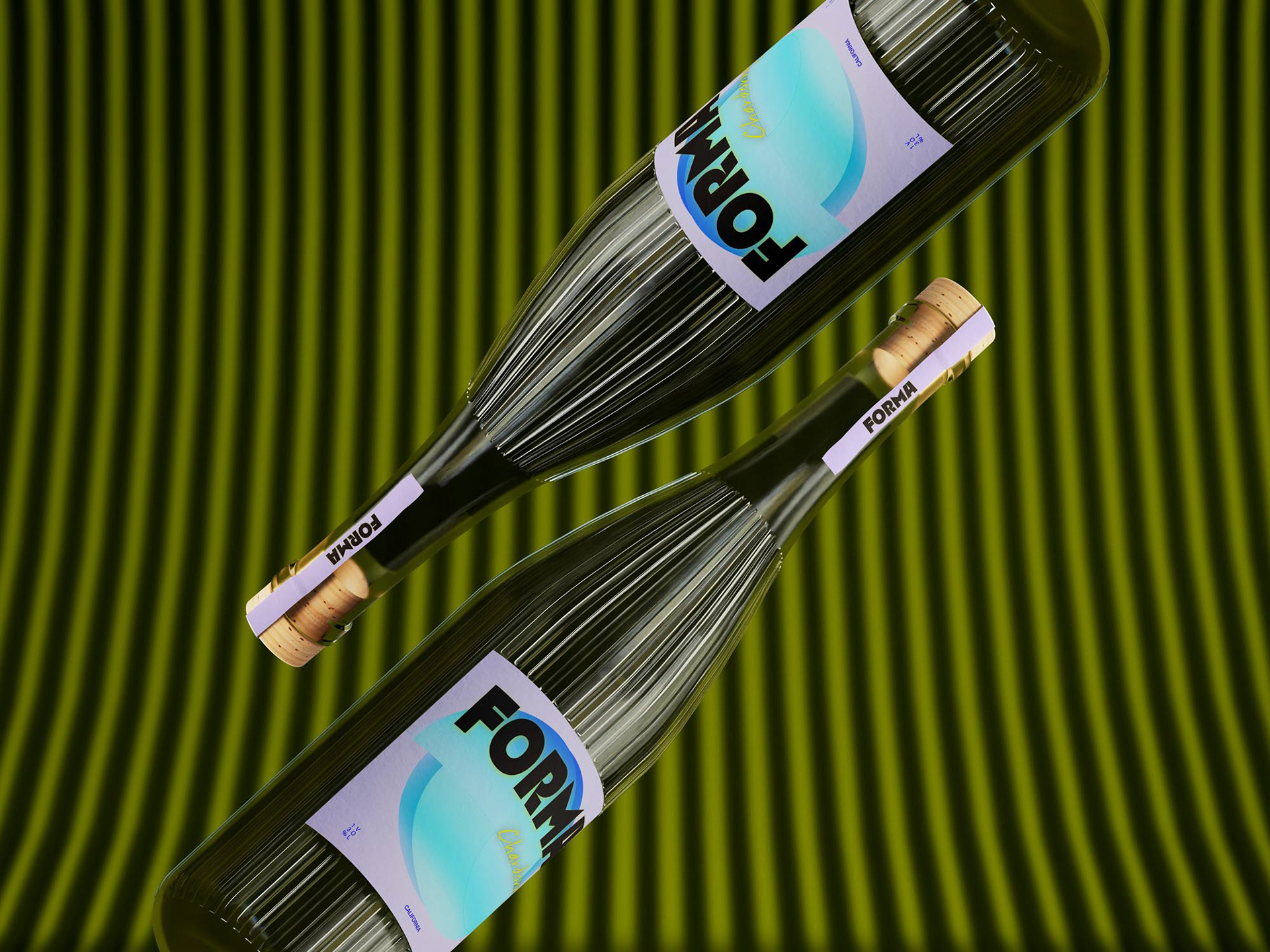
BRIEF
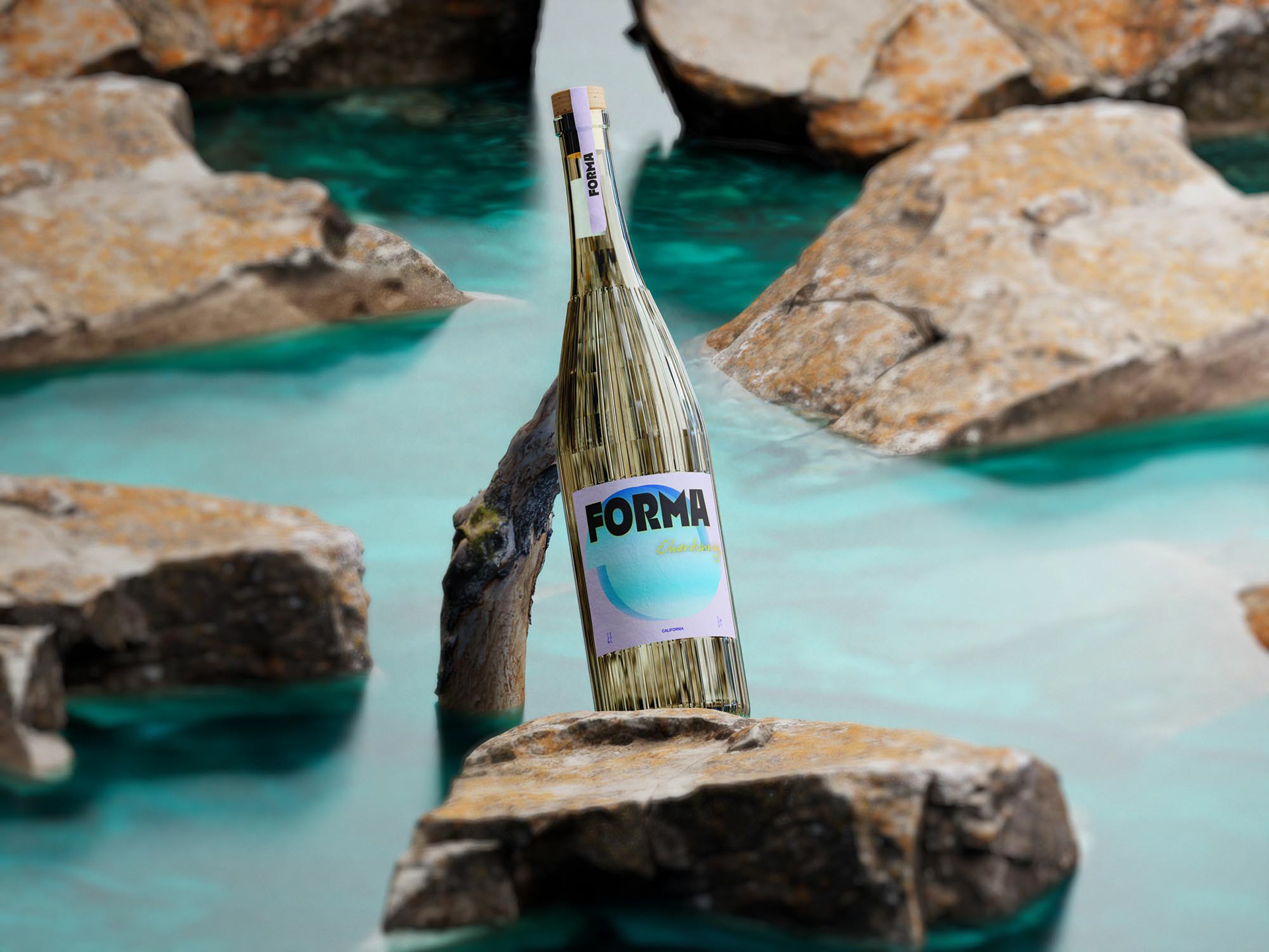
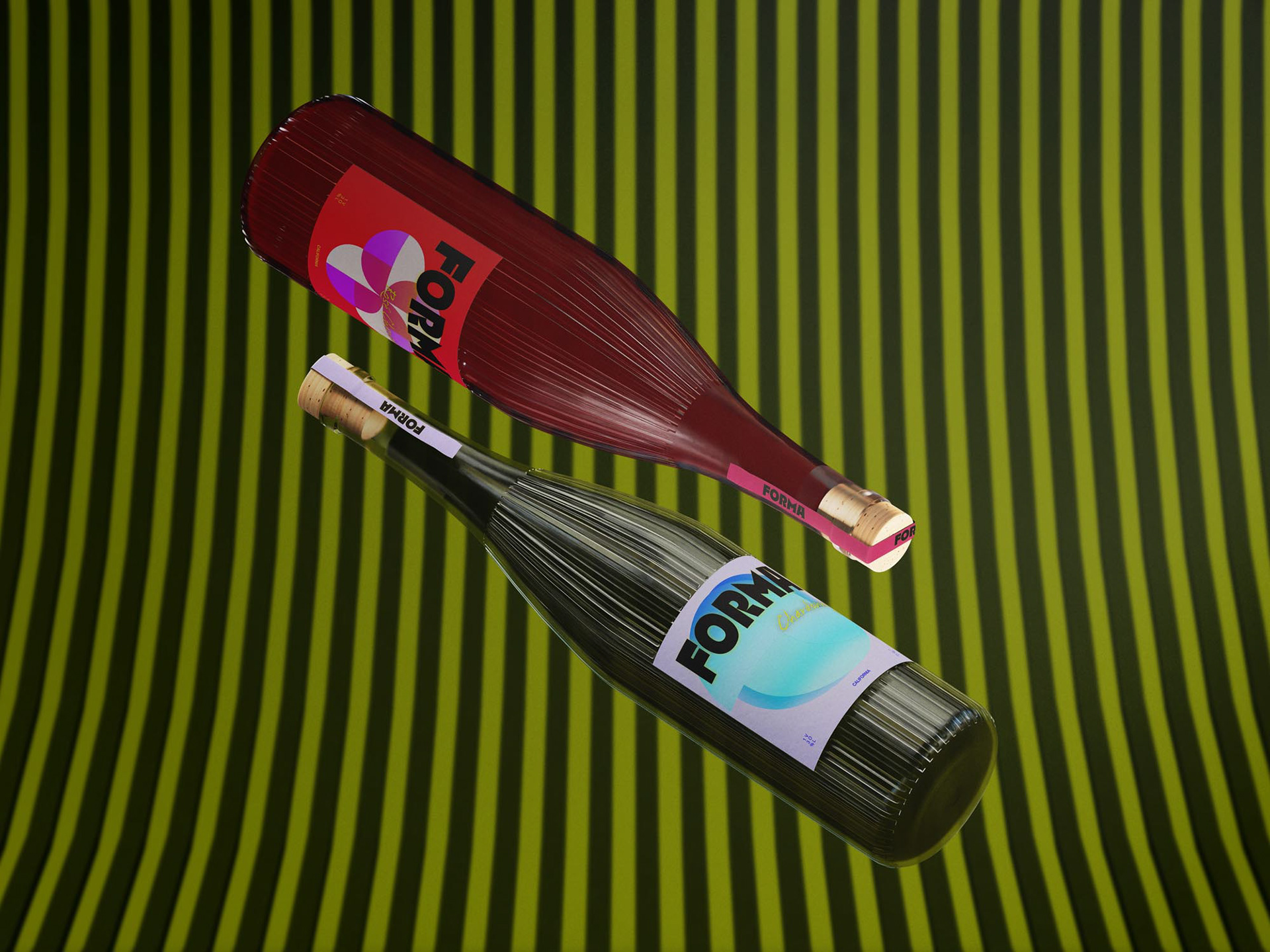
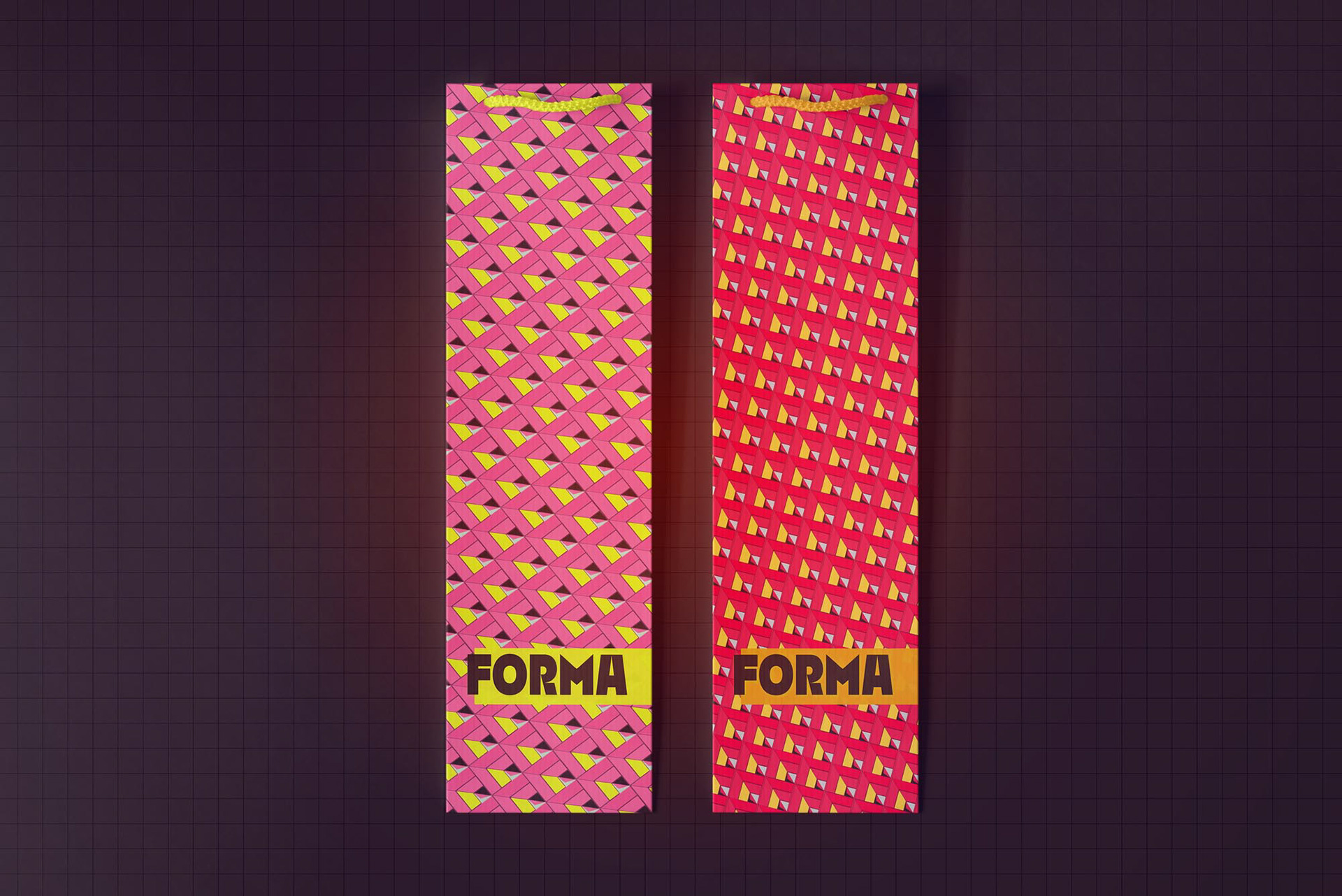
FORMA is a conceptual wine brand built on modernist principles. The project explores how minimal forms, structured typography, and color balance can shape a unified yet expressive visual language.
WHAT I DID
Led the visual identity development from concept to execution, designing the logo system, packaging, and branded collateral with a focus on consistency across digital and physical applications.


AD Campaign